


Socio-Economic Atlas of Kenya
Where in Kenya are most people poor, and where are the most poor people? Is Kenya’s richest county also the one with the greatest inequality? And where is the difference in wealth between the poorest and the richest people biggest? We answer these and more questions about welfare, poverty, and inequality in Kenya by means of interactive visualizations based on the recently published Socio-Economic Atlas of Kenya.
The recently published Socio-Economic Atlas of Kenya uses Census data of 2009 and data from the Kenya Integrated Household Budget to determine relevant indicators of welfare, poverty, and inequality. The Atlas displays results for all of Kenya’s 7,149 sub-locations and summarizes them for the 47 counties that were established with the new constitution in 2010.
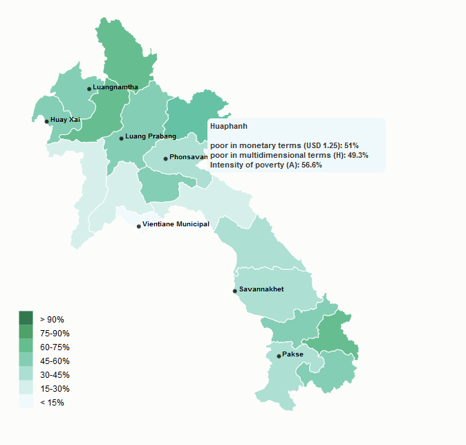
The Atlas reveals that 45% of Kenya’s population or nearly 17 million people were poor in 2009. But the following interactive map illustrates that poverty is distributed unequally among the counties. In some counties, more than 80% of people are poor, whereas this rate is below 30% in others. But a high poverty rate does not yet indicate where most poor people live. The size of the circles in the map therefore shows the absolute number of poor people per county.
The resulting pattern of poverty distribution in Kenya gives hints as to what principles poverty reduction strategies in different parts of the country should follow. In counties with high poverty rates (red colours), efforts must concentrate on strengthening the local and regional economy at large. In counties with low poverty rates (green and yellow colours), poor people should be targeted specifically through social and economic programmes.
Welfare, poverty and inequality
The most widely used indicator of inequality is the Gini coefficient. A Gini coefficient of zero means that every person gets an equal share of the total income, and a Gini coefficient of one means that a single person gets all of the income. The overall Gini coefficient for Kenya is 0.45; those of the counties range from 0.28 to 0.62. However, more and more researchers are pointing out shortcomings of the Gini coefficient – for example, that it is sensitive to changes in the middle incomes, but not to changes among the poorest or richest segments of society.
The chart below shows the inequality in mean consumption per capita by means of the poverty gap and the wealth gap. These indicators show how much lower or higher the average consumption of poor and non-poor people in a county is compared to Kenya’s national poverty line. This bar chart reveals interesting findings: For example, using the Gini coefficient to analyse inequality, one would conclude that equality is greater in Nairobi (0.34) than in Lamu County (0.47). Comparing the two counties’ poverty and wealth gaps, we see that this is not entirely true: the bars are approximately the same length, meaning that inequality is comparable in these two counties.
The bars in this graph indicate two things: First, they show in which counties extra efforts are needed to lift poor people out of poverty. These are the counties with long red bars. Second, they indicate where shocks such as droughts or changes in market prices are likely to push many non-poor people into poverty. These are the counties with short green bars. This example shows that it takes several different measures of inequality to provide adequate guidance regarding appropriate policies and approaches.
Get a Copy of the Socio-Economic Atlas of KenyaWiesmann U, Kiteme B, Mwangi Z. 2014. Socio-Economic Atlas of Kenya: Depicting the National Population Census by County and Sub-Location. Nairobi, Nanyuki, Bern: KNBS, CETRAD, CDE.
- $150.- / CHF145.- / €130.- postage included
- $130.- / CHF125.- / €110.- customer pick up at CDE, Bern, Switzerland / CETRAD, Nanyuki, Kenya
Please send your order to: Get a Copy
Further readings:
Note: A slightly revised version of the Atlas will be published online in June 2016 (see www.kenya-atlas.org)
Dear CDE,
I would like to assemble relevant data to produce a disease map for Kenya and her sub-counties for a project for Aga Khan university hospital. The aim of this mapping is to assess what best practice is needed to be put into place at a national, regional and local level to alleviate the most severe forms of disease and stay on early mortality. I there require social economic indicators as overlays. Please assist with spatial data. Thanks
Dear CDE,
I am carrying out my postgraduate studies at the University of Nairobi, working on developing a tool for managing climate change vulnerability in Kenya. I require spatial data for socio-economic indicators. I attended the launch of this atlas in Nairobi and I’m wondering how I can get access to the sublocation and county data in GIS format. Please help.
Thank you
Hi
We will check this with the responsible person and come back to you as soon as possible.
Kind regards
The CDEdatablog Team