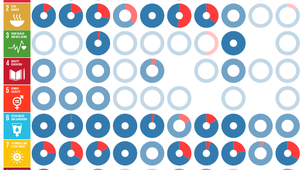
Knowledge for Sustainable Development: Interactive repository of SDG interactions
This is an interactive repository of SDG interactions documented on behalf of the 2019 Global Sustainable Development Report (GSDR), providing


This is an interactive repository of SDG interactions documented on behalf of the 2019 Global Sustainable Development Report (GSDR), providing
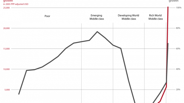
Click for English version. Zehn Jahre nach der globalen Finanzkrise sind deren Folgen noch heute voll spürbar. In der Politik
Click for German version. Ten years on, the reverberations of the global financial crisis are as strong as ever. In
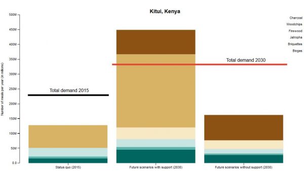
Click for german version. As is common in the developing world, people in East Africa still typically cook their meals
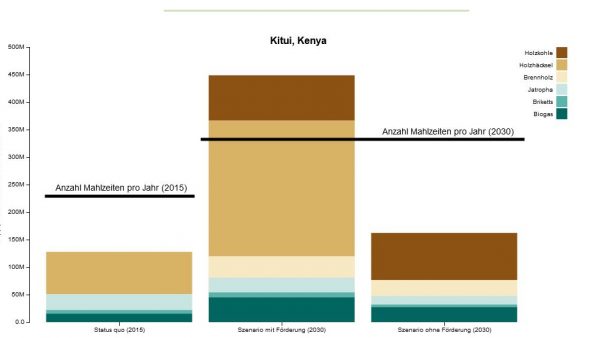
Click for English version. Wie in vielen Entwicklungsländern wird auch in Ostafrika nach wie vor meist mit Holz und Holzkohle
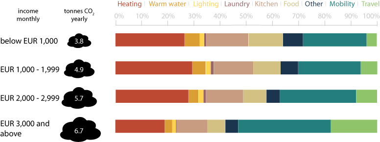
This CDE policy brief looks at energy-related household carbon footprints. Scientists agree that human activity – above all emission of
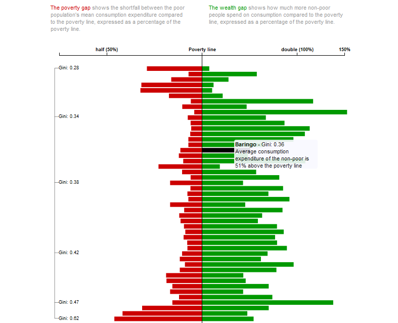
Where in Kenya are most people poor, and where are the most poor people? Is Kenya’s richest county also the one with the greatest inequality? And where is the difference in wealth between the poorest and the richest people biggest? We answer these and more questions about welfare, poverty, and inequality in Kenya by means of interactive visualizations based on the recently published Socio-Economic Atlas of Kenya.
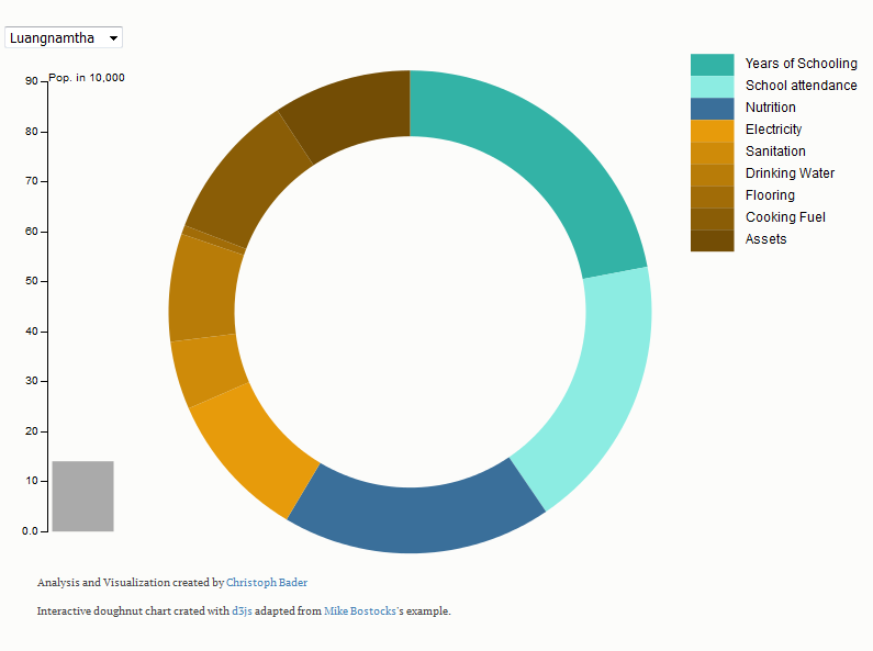
Imagine you have 10 dollars a day, but you have no drinking water, no access to education nor to health services - according to today's poverty measures you are not poor. That's why we need new poverty measures to capture the multidimensionality of poverty. We provide a multidimensional poverty measure for Laos to reveal how people are poor.
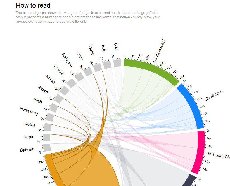
Labour migration in Nepal has existed for centuries, however for some years the rate has increased dramatically reaching about 1500 person per day leaving the country to find work abroad. How can migration flowpaths be visualized? Who and how many travel to what country for what reason? We try to visually describe migration flows from villages of origin in Nepal to people's respective destinations. At a glance migration clusters can be seen in this circlized migration graph.
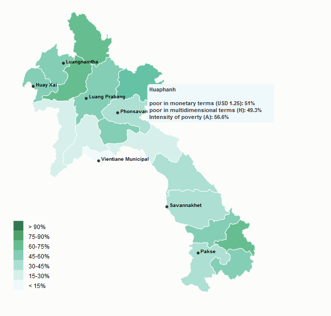
What exactly constitutes poverty? When is a person considered poor, and how many poor people are there worldwide? Are certain population segements at greater risk of being poor than others? The goal of halven the proportion of people living below USD 1.25 a day within the MDG-agenda has been reached in September 2013. But has the living situation of the world's poorest people really improved? In fact, our multidimensional poverty measure for Laos shows that social inequalities have increased, and that assessing poverty requires differentiated means of measurement