Migration patterns in Nepal: where do people go to for work
Labour migration in Nepal has existed for centuries, however for some years the rate has increased dramatically reaching about 1500 person per day leaving the country to find work abroad. How can migration flowpaths be visualized? Who and how many travel to what country for what reason? We try to visually describe migration flows from villages of origin in Nepal to people’s respective destinations. At a glance migration clusters can be seen in this circlized migration graph.
Visualization technique for migration patterns
Until recently migration patterns were visualized through pie charts. One for the origins of migration and one for the respective destinations. The circlize graph allow us to combine both on one graph and to bond them through direction.
Now, this circle graph shows that each village has its preferred destinations for labour and employment in foreign countries, while all destinations are tackled by almost all villages.
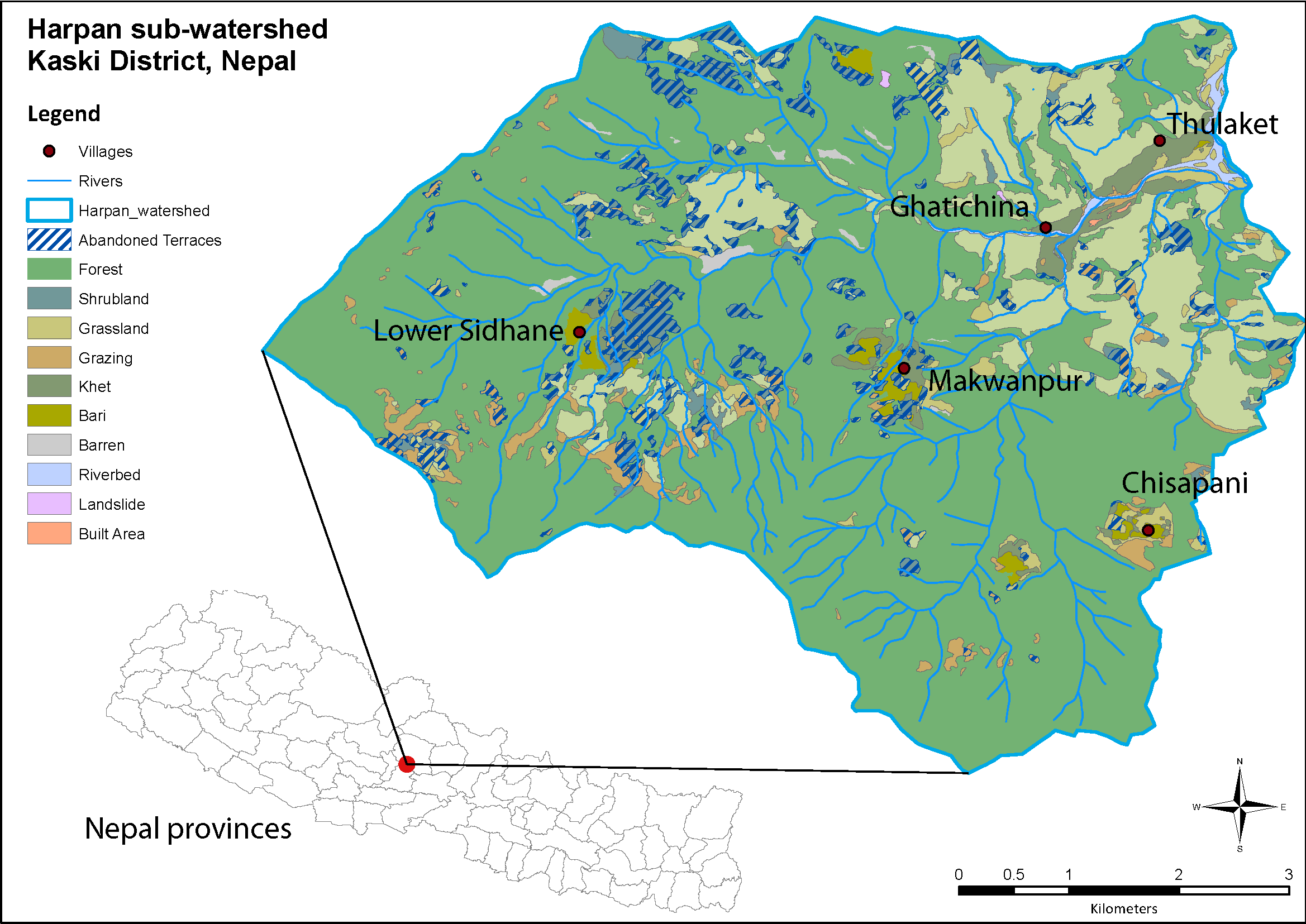
The five villages are situated in the the Kaski district in central Nepal. They are representative for the Kaski district. The survey was conducted in 2013 and consisted of 234 subjects in five villages.
Why we use this visualization technique
Circle graphs can be used to display any kind of information, but they are more suited to visualize data that contains direction and relationship. The Circos website published a number of circle graphs and contains tutorials and documentations for applying your own data for visualization. The Circos website is mostly focussed on medical data, but adaptations are easily done. Code for this visualization can be obtained via the blog admin. Feel free to contact us.
Further readings:- A paper on out-migration from the same author in the same area Jaquet et al. 2015: Does outmigration lead to land degradation? Labour shortage and land management in a western Nepal watershed
- A report from the Ministry of Labour and Employment in Nepal Labour Migration for Employment 2013/2014


